CI
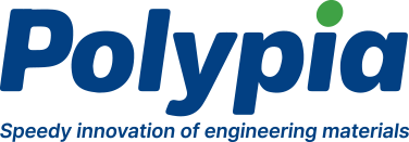
Harmonious and balanced CI that embodies identity of Polypia.


Symbol
The elemental form is expressed in a stylized form, and the image of the hexagonal symbol is balanced with the font to express it without a sense of incongruity. Teratology symbol was developed in order to give meaning to the letter ‘P’ of Polypia, and the overall curved expression was given a soft form to match the logo font. It was developed to match the font logo by adjusting the incline (15 degrees), and the corners were rounded to express soft movement and dynamism.

Type of Logo
The capital letters of POLY PIA., diagonal Gothic font was used in order to express a trustworthy company and an honest and upright corporate spirit, and the roundness of the streamline was added to express strength and softness at the same time. A 15-degree incline was applied to add a sense of speed.


